Friday 26 September 2008
Type Coasters - buy custom personalized products from Ponoko
Tuesday 16 September 2008
Publish your own book with "Blurb"
My former colleague and friend at Ravensbourne, Finola Gaynor, put me onto the software from Blurb. Free to download, it is so easy to use you just drag and drop your photos. Select your layouts and bang in the text. Upload it to the server and then order as many copies as you like. The book is available in softback and hardback. Cool!
Check out the website. www.blurb.com
Monday 15 September 2008
Unisign bag


This shot is taken in my lovely studio!

Emma Williams' Font

Wednesday 10 September 2008
D&AD Xchange Conference
There was an emerging theme about digital advertising that came through many of the presentations. It seems to be the 'new buzz word' although it has been around for quite some time now.
It was great to see that the debate around craft was kept alive by the like of Alan Kitching and his letterpress work. Seeing these pieces in the flesh gave me great inspiration, rather than seeing them as thumbnails in books. The vibrancy of the colour made them hypnotic and I found myself wanting to go home immediately and 'do some work.'
 The sense of playfulness of the work left me wanting more. It is obvious there is a love of what he is doing and the contacts he and his wife Celia gave to the audience regarding letterpress workshops will no doubt be useful.
In stark contrast to this came the work of 'onedotzero' was decidedly high-tech. It may not be completely described as graphic design, although it has links with it. Shane Walter used a few case studies but it was the work of United Visual Artist or UVA that impressed me. They have done many pieces of visual work for bands, including back drop screens for the likes of Massive Attack. The project in particular Shane showed was a light installation for a show in Paris. The installation reacted to movement and music, so the audience had participation with these huge monolithic structures. See images below.


The other speaker that was extremley good was Joel Veitch, with his rathergood.com website. He spoke about how some of the short 'films' he had done for fun and put on his website had attracted a lot of attention from ad agencies and eventually reworked to use for campaigns. The thread of his talk was that just by putting a project on youtube, even something fairly rough could have a massive effect, to the extent you never know how far it could go. The examples were some sketchy collage work to a low-fi song that became a cult hit called 'we like the moon', this became a commercial for Quiznos. Entertaining and very fun, worth checking out.
Tuesday 20 May 2008
3D type
Came across this today and thought it was really cool. For those of you with nerdish tendencies like myself, why send a card when you could send a word instead. It is relatively cheap and much more creative.
You can see my chosen word below. I can see a few friends getting particular messages from me in the near future.
Check out the website: http://www.vialetter.com/index.cfm
Tuesday 13 May 2008
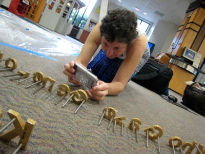
Type Nerd Syndrome (TNS) exists and here is the proof!
I found this on Nancy Sharon Collins blog. The following is a direct quote from the blog, to which I thought, that is me all over!
For more details check it out at: http://nancysharoncollinsstationer.wordpress.com
Herewith please find attached evidence of Type Nerd Syndrome. Last Friday Jen McNight, visiting artist, assistant professor at University of Missouri-Saint Louis, Daniela Marx, tenured professor of graphic design at Loyola University New Orleans and I gamboled and frolicked in this field of type like three kittens playing with a ball of string.
We each found ourselfs nearly prostrate photographing the architectural type being installed in the Loyola library; we photographed each other photographing the type, videoed and laughed, we are hoping to make a presentation with the captures for TypeCon 2009. (I began to wonder if this was some symptom of a serious illness of which we should be aware.)
Type Nerd Syndrome (TNS) is a condition which usually starts with a sharp blow to the head - physical or chemical - during adolescence.
The symptoms are usually mistaken for OCD in non-creative people. In professionals it often earns the afflicted nicknames like ‘Font Police’, ‘Font Cop’, ‘Font Nazi’ or even…. shudder…. ‘Type Director’.


